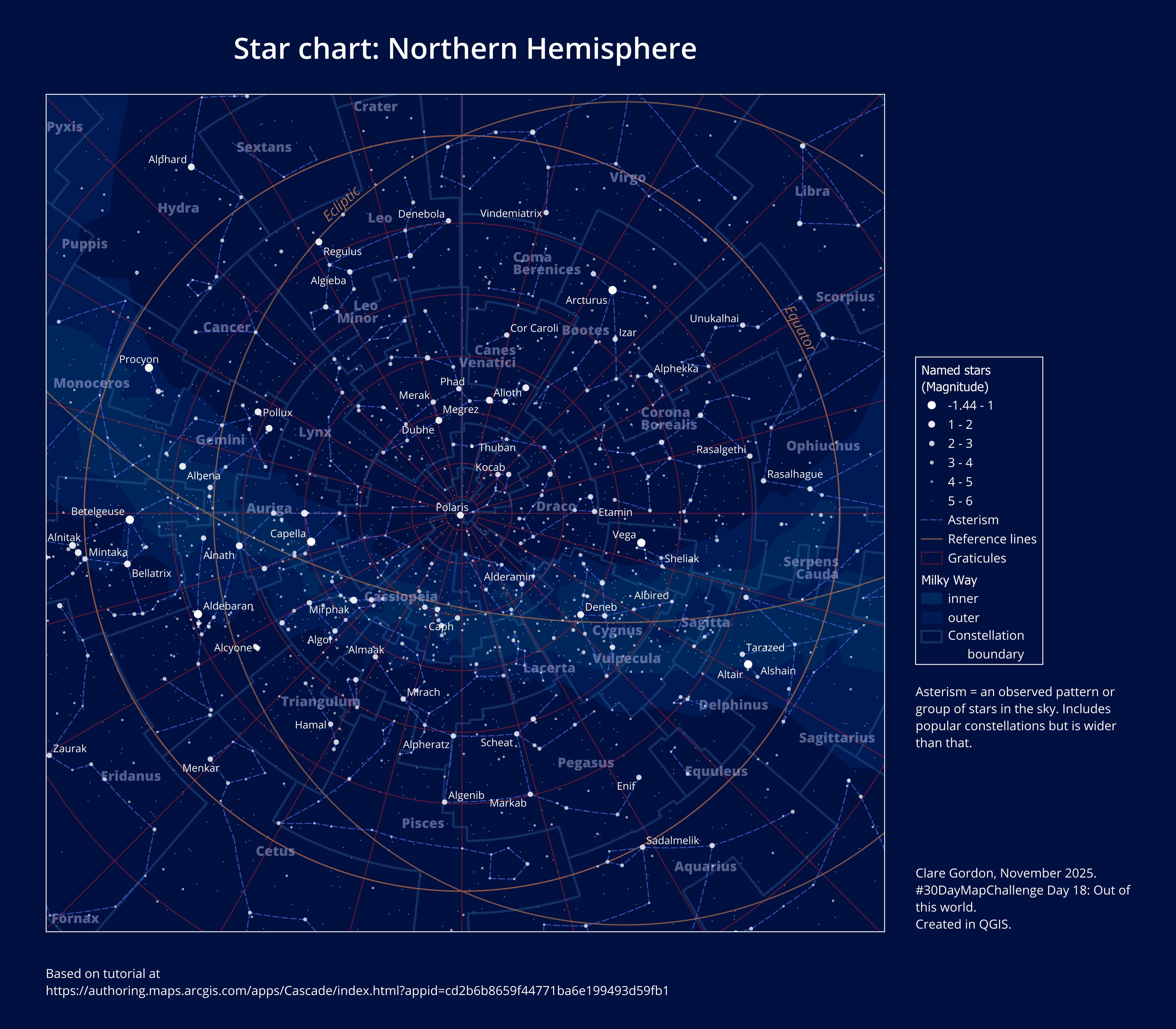
Star chart: northern hemisphere
Inspiration from: The night sky. This does the map in ArcGIS Pro but I’ll try using QGIS instead.
Data
Tools used
- QGIS.
What did I learn?
- Something about stars etc! But still need to know more…
What would I do differently or want to find out?
- Map units for sizes don’t appear to work for this map. The projection? Find out more. Instead worked out display scale, set map view to that and set label sizes in points.
- Can’t mask it as a circular map in QGIS - is this to do with the projection?
- Adding a graticule to a circular map?
- Probably need to take into Inkscape to finish off.
- Adding a southern hemisphere map too - but get the northern hemisphere right first.
Process (more detail about how I made the map)
Adding data
- Downloaded data (see above)
- Coordinates:
- Declination = latitude.
- Right ascension = longitude.
- But right ascension is measured in hours, minutes, seconds. There are 24 hours rather than the 360° of longitude so have to apply the following:
lon = -RA * 15 if lon < -180 then lon = lon + 360- Data provided as GDB with this already applied.
- Convert GDB layers to GeoPackage by:
- Creating new GeoPackage in Browser panel.
- Dragging and dropping GDB layers to GeoPackage.
- Add layers to QGIS.
Projections
Star charts assume “all stars exist on the same surface, on an imaginary sphere surrounding the earth.”
This means we have a sphere with poles and equator so can use projections that apply to earth for this map.
Usual choice is Polar stereographic. Conformal, so keeps the shape of the constellations.
I’m starting with North Pole Stereographic.
- In QGIS set project CRS to
ESRI:102018 North_Pole_Stereographicand zoom in somewhat. - Milky Way layer needs reprojecting to project CRS to display correctly. Would probably apply to other polygon layers too, if I wanted to add those.
Styling
Stars are typically sized based on magnitude (relative brightness). Values range between 6 (faintest) and -1.5 (brightest) to the human eye.
- Set background colour to a very dark blue in the project properties - e.g.
#001041. - Style
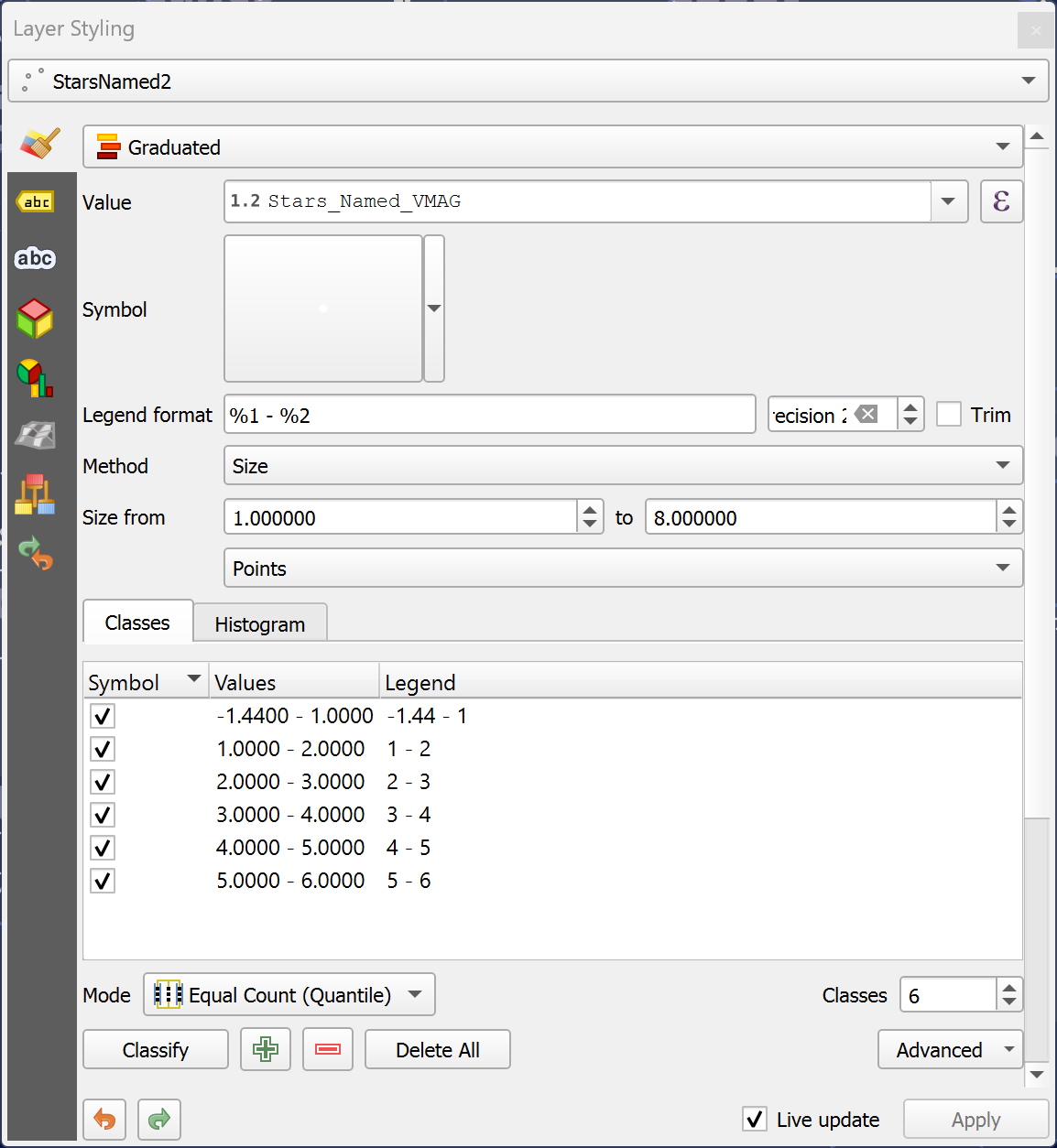
StarsNamed2with graduated symbols:- Value field is
VMAG. - Colour is
white. - Size from
8to1- reversed because magnitude is in reverse. 6classes with values of less than1, 2, 3, 4, 5, 6. Setting highest at 6 removes a lot of the faintest stars and makes chart clearer.
- Value field is
Lots of fiddling around with styling other layers, cross-checking with the maps in the article. Instructions are only given for stars layer.
Transparency
- Milky Way can take a lot of layer transparency. Only needs to be background.
- Constellation polygons are not styled, but labels are large and have transparency applied.
Layer transparency. deepelpsappears to be nebula and clusters - style as browny orange then use transparency set as the colour style so the overlapping is shown. This is what article describes ascolour transparency.- Stars have
transparency based on attribute. Not sure how to do this in QGIS but can set each symbol in turn by clicking on the symbol and setting manually. 6 needs to be the most transparent.
Labels
Label the following:
- Constellation polygons.
- Graticules - probably need to do this manually as these are polygons.
Layout
Want a circular frame to map.
Trying instructions at https://north-road.com/2022/11/04/creating-circular-insets-and-other-fun-qgis-layout-tricks/
- Add map to layout
- Add shape - ellipse, holding
<shift>to make it a circle. - Select map and in
Item propertiesclick onClipping Settingsbutton at top of panel.
This didn’t work. Even reprojecting or switching off Milky Way doesn’t solve it. Probably something to do with hemispheric projection? Don’t know.
Leaving it as square for now and adding key and text.

