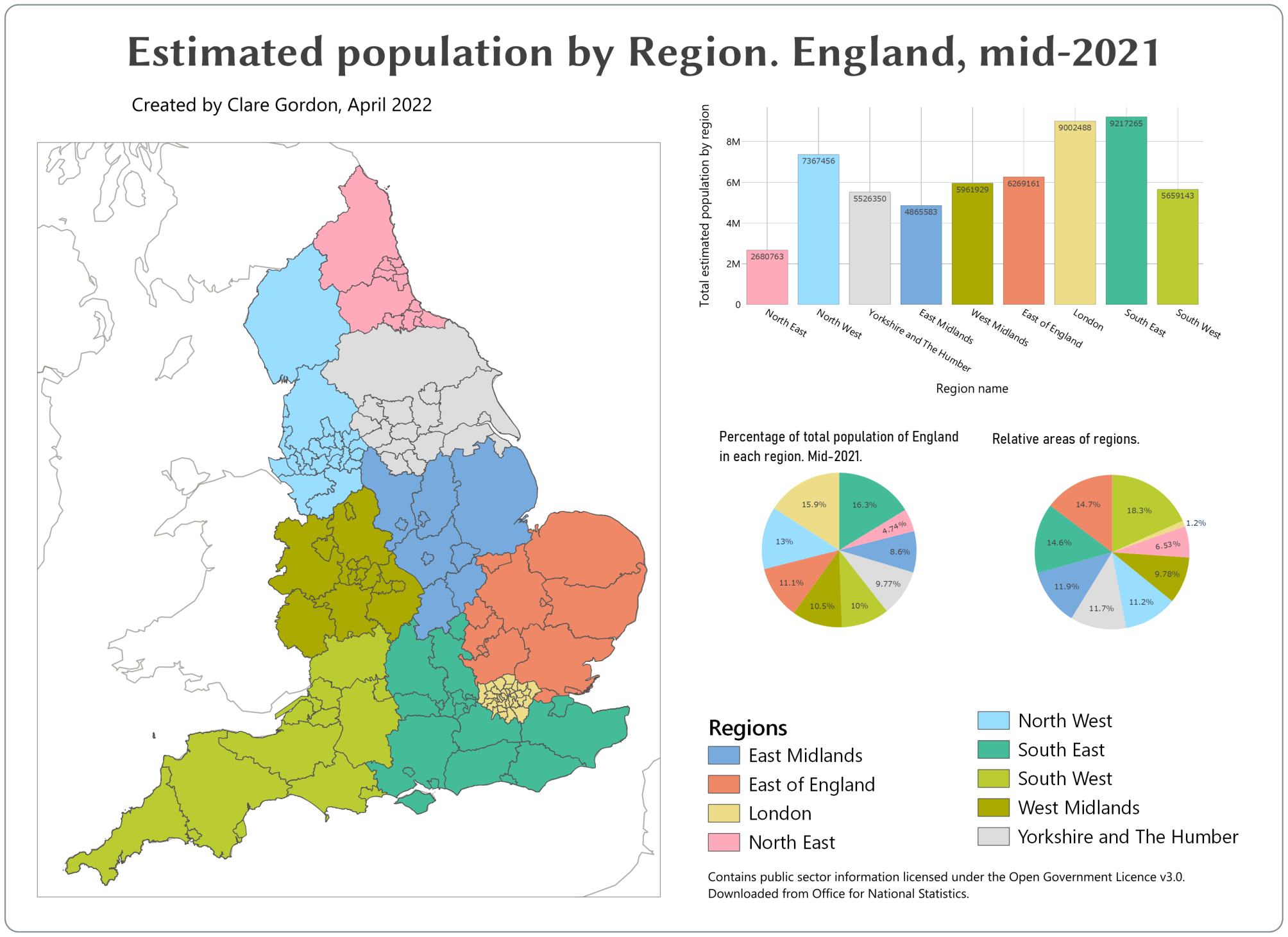
Estimated population of England by Region, mid-2021
For this map I followed a Dynamic infographic map tutorial.
Data
Tools I used
- QGIS
What did I learn?
- Using population data to show how to set colours in map and charts using variables.
- Worked out how to find a colour palette which should be “safe” colours.
What do I want to change?
- Could do with sorting out fonts and text sizes.
- Is it possible to sort plots so regions appear in same order in each?
Process
- Want to use
Counties and Unitary AuthoritieswithinRegions. UsedJoin attributes by locationwithfeatures they...set toare withinandcross. - Clean up population data in spreadsheet then added using
Spreadsheet plugin, but no geometry. - Joined population data to CUA layer with regions.
Refactor fieldsnew layer to check data types OK and saved as new layer- In a change from the tutorial I didn’t use QuickOSM to download data as I already have population data. I just added a WMS background layer to my map.
- Create project variables for colours - need 9? for regions in England. Plus one for dark.
Project > Properties > Variables - Color palette
- Style Counties and UAs within each region - using Region to categorise. Then to use variables for colours, double-click on each colour patch in turn, go to
Simple fill, click on button at end of colour box and selectVariablethen appropriate colour variable. - Set stroke colour to
colour_darkvariable in each case. - Set up layout and add map.
- Then
Add plot. UseSetup Selected Plotto create bar plot. - Next to colour of bar click on button and go to
Editand enter the following.
map_get(
    map(
        'East Midlands',@colour_1,
    'East of England',@colour_2,
    'London',@colour_3,
    'North East',@colour_4,
    'North West',@colour_5,
    'South East',@colour_6,
    'South West',@colour_7,
    'West Midlands',@colour_8,
    'Yorkshire and The Humber',@colour_9),"RRGN21NM"
)
Statistics by categoryto generate regional population totals.
